Reading Agile Progress: Burndowns, Velocity, and Radiators
Status Without Asking
Consider the standard status report. A PM asks team leads for updates, each team lead writes a paragraph summarizing what finished, what is in progress, and what is blocked. The PM synthesizes those paragraphs into a consolidated document, formats it, and distributes it to a stakeholder list. The report goes out Friday. It describes the state of the project as of Thursday, built from information the team leads compiled Wednesday afternoon. By the time the CFO reads it Monday morning, the data is four days old. That is how traditional project status works: periodic aggregation, point-in-time accuracy, structural latency built into every cycle. The report is always a document about the recent past, distributed to people who need to make decisions about the near future.
Agile teams replace that cycle with continuous visibility. Instead of pushing status outward through reports, the team makes status ambient, available to anyone who looks without anyone having to compile it. The sprint board on the wall shows which stories the team is working on right now, which are blocked, and which are done. A burndown chart on a shared screen shows whether the sprint is on pace or falling behind. A velocity summary in a shared tool shows whether the team's throughput is stable or drifting. Any stakeholder who wants to know how the sprint is going can walk past the team's space and find out without pulling anyone into a conversation. That ambient availability is not simply faster reporting. It is a different model of accountability: the team's work is visible at all times, which changes how the team manages its own pace and how stakeholders engage with progress.
This matters for your role as a PM or project participant because it shifts what you are responsible for communicating. In a traditional environment, you own the status report. You produce it, you own its accuracy, and you absorb the questions when something in it is unclear. In an agile environment, the tools produce the status continuously, and your job is to ensure those tools reflect reality honestly, that the board is updated as work moves, that the burndown is not running green when the team is quietly behind, and that stakeholders understand how to read the displays. That is a different kind of communication work. The rest of this chapter covers the specific tools that make it possible, and what each one is actually telling you when you know how to read it.
Burndown Charts — Reading the Remaining Work
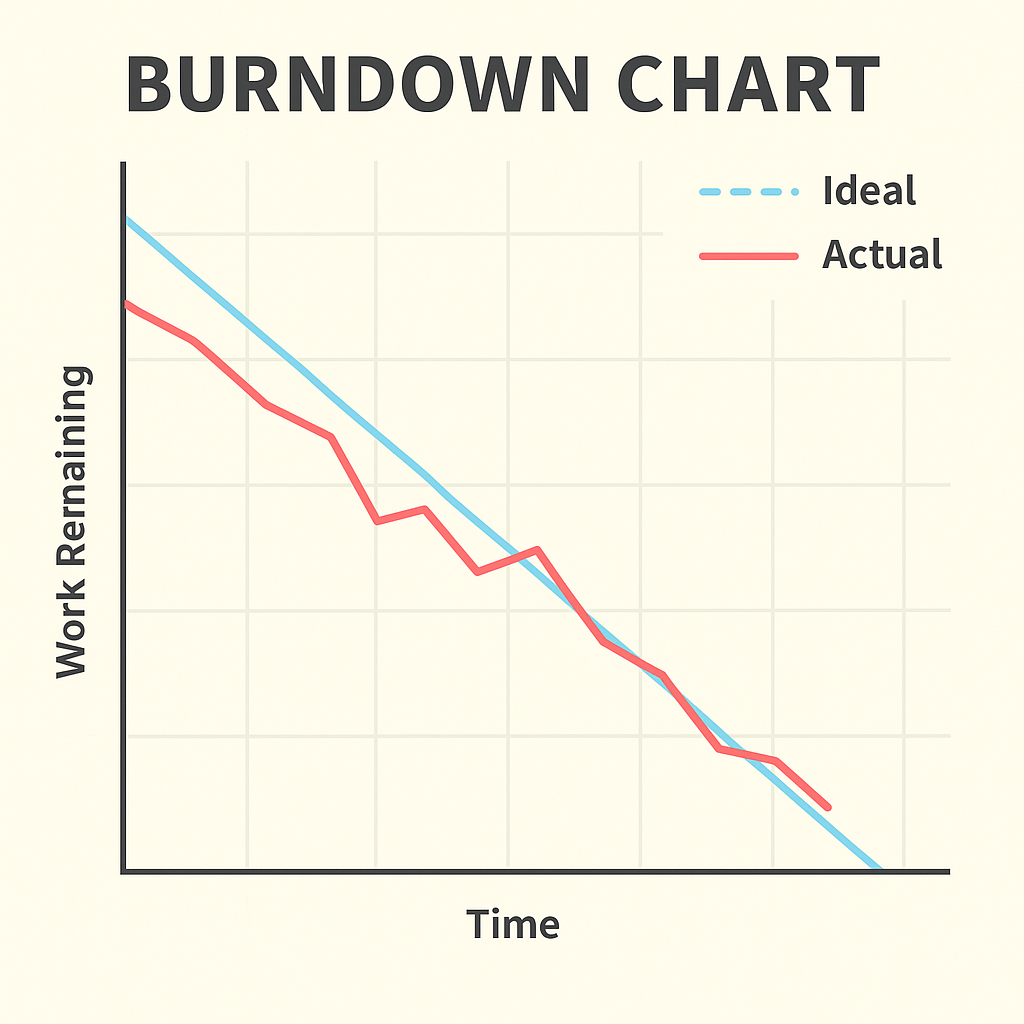
A burndown chart plots two variables against each other: work remaining on the vertical axis, and time elapsed on the horizontal axis. The chart begins in the top left corner, where the sprint starts and all committed work is still unfinished. The goal is the bottom right corner, where the sprint closes with zero work remaining. A straight diagonal line connecting those two points represents the ideal pace, the mathematical baseline showing what consistent, even completion would look like across every day of the sprint. In practice, the team's actual line never matches the ideal exactly. Stories take longer than estimated. A dependency surfaces. A team member gets pulled into an incident. Progress is lumpy, not smooth. The burndown's job is to make that lumpiness visible and measurable so you can assess whether the sprint is recoverable or whether you need to have a harder conversation.
Walk through a concrete example. A ten-day sprint carries twenty story points. The ideal line drops by two points per day: twenty on day zero, eighteen at end of day one, sixteen at end of day two, and so on toward zero at the close of day ten. On day three, the team has completed six points and the actual burndown shows fourteen remaining. That matches the ideal line exactly. Day five arrives: the ideal line shows ten points remaining, and the actual line shows thirteen. The team is three points behind the midpoint. That is a manageable variance but a clear signal to watch. If you are in a daily standup at day five and the burndown shows thirteen remaining, the question to ask is not "why are you behind?" but "what would need to be true to finish on time, and is that realistic?" Sometimes the answer is yes, there is a story about to complete that will close the gap. Sometimes the answer is no, and the team and product owner need to decide what to cut from the sprint so that the most valuable work ships.
The patterns a burndown creates carry specific meanings that experienced PMs learn to read quickly. A line that runs flat for two or three consecutive days signals one of two problems: stories are in progress but not completing (a blocked state), or the team is adding undiscovered work back into the sprint as they find it (scope is growing mid-sprint). A burndown that stays nearly flat through the middle of a sprint and then drops sharply in the final two days is a late-heroics pattern. The team accelerated at the end to meet the deadline, which often means pushing work through without adequate testing or review. The sprint closes on paper, but the technical debt generated in that rush shows up as defects in the next sprint. None of these problems are visible from a weekly status report. They are visible on the burndown, in real time, while there is still time to respond.
Burnup Charts — Seeing the Full Picture
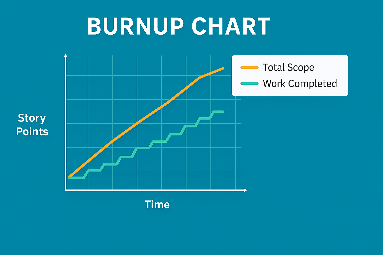
A burndown chart shows work remaining. A burnup chart shows work completed, but that reversal is not the point. The point is what becomes visible when scope changes. On a burndown chart, every story the team commits to at sprint planning contributes to the starting count of remaining work. If the product owner adds a story on day four because a new requirement emerged, the remaining-work line simply stops dropping as fast. The reader sees the chart decelerating but cannot tell, from the chart alone, whether the team slowed down or the scope grew. The cause and the symptom look the same from the outside.
A burnup chart separates them by plotting two lines. The first line tracks cumulative work completed, starting near zero and climbing toward the target as stories are finished. The second line tracks the total scope, the agreed target for the sprint or release. When no scope changes occur, the scope line stays flat, and the completed-work line climbs toward it. When a story is added, the scope line moves upward, creating a visible gap between where the completed work is and where the new target sits. That gap is the scope change, rendered on the chart as clearly as the team's throughput. Stakeholders watching a burnup chart during a multi-sprint release can see exactly when scope expanded, by how much, and whether the team's completion rate kept up with the addition or fell behind it.
The practical guidance on which to use depends on the question being asked and the level of visibility needed. Burndown charts are the standard choice for sprint-level tracking. The format is intuitive, most agile tools generate them automatically, and teams understand them at a glance. Burnup charts are better suited to release-level tracking across multiple sprints, particularly in environments where scope negotiation is ongoing. If your product owner is regularly adding, removing, or reprioritizing stories between sprints, and your stakeholders need to see that movement clearly rather than infer it from a decelerating burndown, the burnup chart is the more honest display. Know both. Use the one that answers the question your stakeholders are actually asking.
A software team runs a six-sprint release targeting 120 story points. By sprint four, their burndown shows a reasonable trajectory: roughly 40 points remaining, on pace for a sprint-six close. What the burndown does not show is that the product owner added 18 points of new stories across sprints two and three in response to stakeholder feedback. The team has actually completed more work than the burndown suggests, because the starting count kept getting revised upward. A burnup chart, maintained from the beginning of the release, would show the scope line rising at sprints two and three, while the completed-work line climbed steadily. The stakeholders would see both the team's consistent throughput and the reason the release has not converged faster than expected. On the burndown, the scope additions are invisible. On the burnup, they are the most important feature of the chart.
Velocity — A Forecasting Tool, Not a Target
Velocity is the average number of story points a team completes per sprint, calculated over a recent window of three to five sprints. A team that completed twenty-two points in sprint one, eighteen in sprint two, and twenty in sprint three has an average velocity of twenty points per sprint. The calculation is straightforward: sum the completed points and divide by the number of sprints in the window. What velocity enables is a release forecast without requiring a detailed schedule. If the product backlog carries eighty points of remaining work and the team's average velocity is twenty points per sprint, the forecast is four more sprints. At two-week sprint intervals, that is eight weeks. That number is an estimate built on recent throughput rather than on task-level duration estimates, which makes it both faster to produce and, in many cases, more accurate than a Gantt-based calculation built on work that has not yet been fully defined.
| Sprint | Story Points Completed | Notes |
|---|---|---|
| Sprint 1 | 22 | Team at full capacity |
| Sprint 2 | 18 | One team member on leave, three days |
| Sprint 3 | 20 | Team at full capacity |
| Average Velocity | 20 pts/sprint | (22 + 18 + 20) ÷ 3 = 20 |
With 80 story points remaining in the backlog and a velocity of 20 points per sprint, the team forecasts four more sprints to completion, which is eight weeks at two-week intervals. The calculation takes seconds. What matters is that it is built on actual throughput, not theoretical estimates for work that has not yet been fully scoped.
The misuse of velocity is common enough that it deserves direct treatment. When a manager looks at a velocity trend and tells the team their number needs to increase, the team faces a structural problem. Genuinely completing more work per sprint requires changes to the team's composition, capability, process, or capacity. Those changes take time and are not within the team's immediate control. What is within the team's immediate control is how they estimate. A story the team previously sized at three points becomes five points at the next planning session. The work hasn't changed. The estimate is higher. Velocity goes up. On paper, that looks like improvement. That inflated velocity then produces a release forecast saying delivery is further away than it actually is, which confuses stakeholders when the team delivers earlier than predicted, or worse, becomes a self-fulfilling prophecy as teams expand their work to fill inflated estimates. The velocity number is easy to move. What actually matters is the delivery rate, and no estimation manipulation changes it.
Velocity is also strictly team-specific, and this is the property most often ignored in organizations that manage multiple agile teams. Each team calibrates their story point scale through their own experience, their own reference stories, their own definition of a one-point task versus a three-point task. Team A and Team B have each done that calibration, but against entirely different baselines. Both teams may report a velocity of twenty points per sprint while shipping very different quantities of actual work. Comparing those numbers to assess "which team is more productive" produces a conclusion that is mathematically wrong and organizationally harmful. If you sit in a meeting where multiple teams' velocities are placed side by side for comparison, that is your moment to redirect the conversation toward what each team is actually shipping, not how their point counts rank against each other.
Information Radiators — Making Progress Visible
An information radiator is any display that makes the team's status visible to anyone who wants to look without requiring them to ask. The term comes from Alistair Cockburn's work on agile methodology, and the concept aligns directly with one of Scrum's three foundational pillars: transparency. A physical Kanban board covered in sticky notes in a team's shared workspace is an information radiator. The television mounted on the wall cycling through sprint burndown, velocity trend, and the current sprint goal is an information radiator. A shared digital dashboard with real-time data that any stakeholder can access from their desk is a digital information radiator. The format varies. The principle is constant: status is always on, always accessible, and requires no meeting, no email, and no formal request to consult.
Three qualities determine whether a radiator is actually working. The first is freshness: the display must reflect current status, not yesterday's or last week's. A board where stories haven't been moved in three days because the team is busy working rather than updating the board is technically a radiator but practically a historical document. The second quality is accessibility: the radiator must be in the path of the people who need it, whether that means a prominent wall in the team's workspace or a link at the top of the project's shared navigation rather than buried three clicks into a wiki. The third quality is honesty, and this is the hardest to maintain. Under pressure, teams are inclined to leave the burndown showing a manageable trajectory one day longer than the actual situation warrants. Moving a story card back to "blocked" after it has been in progress feels like a step backward. An information radiator that reflects optimistic approximations of status is worse than no radiator at all, because it generates false confidence in the stakeholders who use it to calibrate their own expectations and decisions.
The downstream effect of well-maintained radiators is a reduction in the volume of status meetings. Much of what a weekly status meeting accomplishes is answering questions that a good radiator answers continuously: what is the team working on right now, is anyone blocked, is the sprint on track, what stories completed since the last check-in. When those questions are answered by a board that any stakeholder can consult at any moment, the pressure to schedule a weekly sync to ask them diminishes. That does not eliminate sprint ceremonies; the retrospective, the sprint review, and the planning session each serve purposes that a static display cannot. But the ad-hoc status check-ins, the requests for a "quick update," the email chains asking whether a particular feature will be ready by a particular date: those diminish in teams that maintain their radiators honestly, because the questions they address are already answered before anyone asks them.
What to Look for at Sprint Reviews
The burndown tells you what happened during the sprint. The sprint review shows you what it means. A team can close a sprint with zero work remaining on the board and still have a failed sprint if the work does not meet the sprint goal or does not satisfy actual acceptance criteria. A team can finish twelve stories and still have produced nothing the user can operate if the twelve stories were foundational plumbing with no visible end-user behavior. Reading the burndown prepares you for the sprint review. Attending the sprint review is how you find out whether the burndown told the full story.
The first thing to assess when attending a sprint review is whether the demonstrated work matches the sprint goal, not just the story list. Teams commit to a sprint goal at planning: a statement of what the sprint is intended to achieve, not a list of features but the purpose those features serve. A sprint goal might be "users can complete the account registration flow end to end without assistance." If the team completes every story on the board but the registration flow breaks on the email verification step, the stories are done and the goal is not. That distinction matters because the sprint goal is what the product owner communicated to stakeholders as the sprint's purpose. Delivering eleven stories that do not collectively achieve the stated goal is a miss, even if the burndown hit zero.
The second thing to watch is how acceptance criteria are verified during the demo. Sprint reviews sometimes include demonstrations that work correctly when operated by the developer who built the feature, following a practiced sequence in a controlled environment, but would fail in the hands of a user approaching the feature without that background knowledge. If the person demonstrating a feature is the person who built it, and the demonstration follows a path that avoids the edge cases, the review is not confirming delivery; it is confirming that the feature works along its happy path in one person's hands. Ask to see a representative user try it, or ask the product owner to operate the feature during the review rather than the developer. That single adjustment surfaces more incomplete work than any other technique in the sprint review.
The third and most important signal in a sprint review is what the stakeholders do with what they see. Engaged stakeholders ask questions, challenge assumptions, recognize implications, and leave with changed priorities. They watch a feature demonstrated and realize it triggers a requirement they had not previously articulated. They see the implementation and decide the design direction is wrong, even though the specifications were followed correctly. That feedback adjusts the backlog, either by adding new items, reprioritizing existing ones, or removing work that the demonstration revealed was not actually needed. A sprint review where stakeholders watch the demo, say it looks good, and leave without generating any backlog changes is a warning sign. Either the work shown was exactly what was needed with no new learning generated, which is possible but rare, or the feedback loop has broken and stakeholders are attending as observers rather than participants. The product owner should walk out of most sprint reviews with something to update. When the backlog is unchanged after a review, ask whether the right people were in the room and whether they felt genuinely invited to respond.
A product team running two-week sprints held their sprint reviews in a conference room with the standard stakeholder list: the product owner, two business analysts, and a director who represented the business. For six sprints, the director nodded at the demo, said "looks great," and left. The burndowns closed consistently near zero. Velocity was stable. On sprint seven, the director brought in the person who would actually use the system day to day. Within ten minutes of that person touching the interface, three significant gaps in the workflow surfaced that the previous six reviews had not identified. None of those gaps appeared in the burndown. None appeared in the velocity trend. They appeared the moment someone outside the project team tried to use what the team had built. The sprint review was not broken because the metrics were wrong. It was broken because the feedback loop had never connected to the people with real operational knowledge of the work.
What's Next
The next chapter examines how the PM role shifts in agile environments: what responsibilities stay the same, what changes fundamentally, and how the PM's relationship with the Scrum Master defines the boundary between project governance and team self-management.
Reflect
- A burndown line that runs flat for three days and then drops sharply at the end of a sprint suggests late-heroics compression. If you observed this pattern in a sprint you were managing, what questions would you bring to the retrospective, and what changes would you consider proposing for the next sprint?
- The chapter argues that using velocity as a performance target produces inflated estimates rather than improved throughput. Have you seen this dynamic play out in a team or organization you know? What did the velocity trend look like, and what did actual delivery look like during the same period?
- An information radiator is only as useful as its accuracy. Think about a team or project you have been part of: was the status display honest, or did it lag behind actual conditions? What made it easier or harder to maintain honestly, and who had the authority to change it?
- A sprint review where stakeholders leave without changing the backlog is described here as a warning sign. Consider a review you have attended or heard described where significant feedback did not result in backlog changes. What happened to that feedback, and what would a better outcome have looked like?
Advanced Lean Six Sigma — Data-Driven Excellence
Solve complex problems, reduce variation, and improve performance with confidence. This course is designed for professionals who already know the basics and want to apply advanced Lean Six Sigma tools to real business challenges.
This is not abstract statistics or theory-heavy training. You’ll use Excel to perform real analysis, interpret results correctly, and apply tools like DMAIC, SIPOC, MSA, hypothesis testing, and regression without memorizing formulas or relying on expensive software.
You’ll learn how to measure baseline performance, analyze process capability, use control charts to maintain stability, and validate improvements using statistical evidence. Templates, worked examples, and structured walkthroughs help you apply each concept immediately.
Learn through a complete, real-world Lean Six Sigma project and develop the skills to lead data-driven improvements with credibility. If you’re ready to move beyond basics and make decisions backed by data, enroll now and take your Lean Six Sigma expertise to the next level.

Launch your career!
HK School of Management delivers top-tier training in Project Management, Job Search Strategies, and Career Growth. For the price of a lunch, you’ll gain expert insights into landing your dream PM role, mastering interviews, and negotiating like a pro. With a 30-day money-back guarantee, there’s zero risk—just a clear path to success!
Learn More