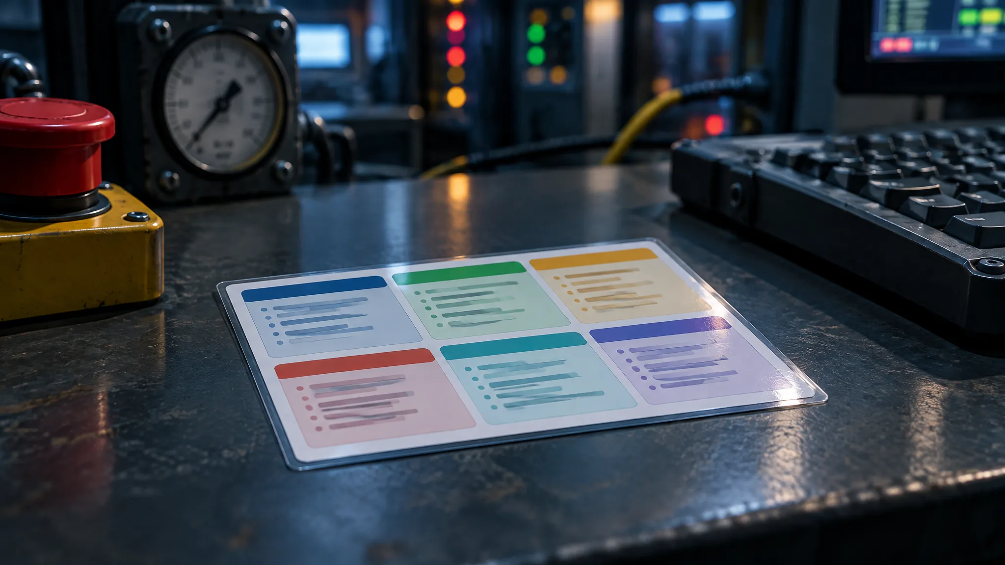
Half a sheet of US Letter, five and a half by eight and a half inches, laminated in matte film so the ceiling lights do not bounce off it. Black type on pale yellow. A title you can read from the next chair. Below it, a box of three yes-or-no questions, a short numbered list, a table of phone numbers, and one line at the bottom that tells you when you can put the card down. That is the whole incident response plan, as far as the first person on scene is concerned.
The sixty-page plan still matters. It holds the authority, the definitions, the notification clocks and the recovery criteria. But in the first five minutes of a cyber incident, nobody on the night shift opens it. They reach for whatever is taped to the console. If nothing is there, they improvise. If something is there and they cannot read it, they improvise anyway.
Legibility under pressure is a studied problem. NASA's research on the typography of flight-deck documents (Degani, CR-177605, 1992) opens with a case the US National Transportation Safety Board looked into: an airline checklist set about 57 percent smaller than human-engineering criteria. The board did not find that the type caused the accident it was investigating, and it still asked the aviation regulator to act. The report's recommendations, from sans-serif type to anti-glare laminate, are the backbone of what follows.
This is for whoever has a first-hour procedure, or is writing one, and has been asked for "something we can hang at the console". If your plan has no first-hour procedure yet, read on, but note the second warning below before you design anything.
The card, block by block
Think of the card as a product with one user and one moment of use. The user is the first person on scene: an operator or a contractor, before anyone has taken a command role. The moment is the first few minutes. Every block on the card serves that person in that moment, and anything that serves someone else belongs somewhere else.
Here is what that looks like filled in, for a fictional packaging plant we will call Ashby Works. The plant, the screen names, the extension numbers and the radio channel are all invented for the example.
| Block | Ashby Works operator card (fictional) |
|---|---|
| Title strip | suspected cyber event: operator, first 15 minutes |
| Safe first | Is every line in a state you would accept on a normal night? Are the safety system lights normal on panel SP-1? Can you still stop each line from its local panel? Any "no": GO TO emergency shutdown procedure ESD-02, then return to this card. |
| Do now | 1. Write the time from the wall clock in the shift log. 2. Photograph HMI-2 with the control-room phone. 3. Call the shift supervisor. 4. Leave every computer powered on and logged in. 5. Keep running the lines under normal procedures. 6. Write down what you saw, and on which screen. |
| Call | Shift supervisor: ext. 2200, alternate ext. 2201, radio channel 4. Incident lead: ext. 2300, alternate mobile per register row C-02, radio channel 4. |
| Done when | The supervisor has taken over. Hand this card to the supervisor. |
| Control strip | QRC-01, revision 3, effective 1 November, copy 4 of 7. Condensed from first-hour procedure FH-01, revision 5. |
Now the design rules, which is where most cards fail even when the content is right. From Degani's recommendations: a sans-serif typeface with no characters that look alike, lower case for running text because all capitals slow reading, a lowercase letter height of at least 0.10 inch for important documents, line spacing of at least a quarter of the type size, and no more than one or two ways of adding emphasis. By our own conversion from the font metrics, 0.10 inch works out at about 14 point body text in Arial or Verdana, and about 16 point in Calibri, with headings near 18 point. Degani's colour advice is black on white or yellow, never on dark red, green or blue, and the laminate should be anti-glare. Add two rules of our own. Colour only repeats information the words already carry, because a red-only warning disappears in dim light or for a colour-blind reader. And print tags and phone numbers in a font where zero and the letter O cannot be confused; a monospaced font does it.
Does your current card, if you have one, pass the letter-height rule? Measure a lowercase x with a ruler. If it is under a tenth of an inch, the content can be perfect and the card still fails.
"A laminated card is a 1990s answer"
Our plan lives on SharePoint, and the procedures are a click away on the HMI. Why would we go back to laminated paper?
Because in a cyber incident the screen may be the thing that has been compromised, or the thing an attacker has locked you out of. A plan that can only be read through the network it is meant to protect fails at the moment it is needed. NIST's Guide to Operational Technology Security (SP 800-82 Revision 3, section 6.2.4.5) says response material should be kept in "paper form or on an offline system" for this reason. Keep the electronic copy for convenience. Make the paper card the authoritative one at the console.
"Our first hour does not fit on half a page"
Our first-hour procedure is four pages long. There is no way I am getting that onto one side of a card without leaving out something important.
You are not meant to fit it. The card condenses; it does not reproduce. Read your first-hour procedure and ask of every line: does the first person on scene need this before anyone with a command role arrives? The answer is yes for very few things. Safety checks, the time, a photograph of the screen, one call, the instruction not to reboot or unplug anything, and keeping the process running. The escalation time limits, the pre-authorized actions, the evidence steps and the classification table all stay in the procedure, where the supervisor will read them. Every line on the card must also appear in the procedure, at the revision named in the control strip. If the card says something the procedure does not, one of them is wrong.
"Cards go stale, and they walk"
Numbers change every few months. Contractors pick cards up and leave with them. And the auditor will want to know what we have posted on the wall where anyone can read it.
All three are design problems with design answers. Print the Call block from the contacts register at every release, and never let anyone correct a number with a pen: a handwritten number on a laminated card is a stale procedure waiting to be dialled. Give every printed card a copy number, keep a list of where each copy lives, and collect the old ones when a new revision goes out. And treat the card as a public document, because it is one. Phone numbers and radio channels are fine. Network addresses, passwords, where passwords are kept and network drawings never go on it.
The test is arm's length, not proofreading
A card is finished when it has been read, not when it has been written. Print it at real size on the material you will use. Hand it to an operator who did not write it, ideally one who wears reading glasses, at the console, under the real lights. Ask them to read it at arm's length and say what they would do. Watch for three things: whether they can find every screen, phone and radio channel it names without leaving their seat, whether any line makes them hesitate, and whether the laminate throws glare across a block. That is a check of the design, not an exercise, and it costs ten minutes.
The smallest document in your plan is the one the most people will ever read. It deserves the most design attention, not the least.
Sources: Degani, On the Typography of Flight-Deck Documentation, NASA CR-177605, 1992 | NIST SP 800-82 Rev. 3, Guide to Operational Technology (OT) Security, 2023