If you have been following this series, you now know how to use Monte Carlo simulation to predict your project’s finish date. You have seen the S-Curve, and you know how to find your P90 ‘Safe Zone.’ But as a project manager, knowing when you might finish is only half the battle. The next question your boss will ask is: ‘Why is the date so late, and what can we do to fix it?’
This is where the Tornado Chart becomes your most powerful diagnostic tool. While the Monte Carlo simulation tells you the total project risk, the Tornado Chart performs a ‘sensitivity analysis’ to show you exactly which task is the biggest threat to your deadline. It identifies the ‘Risk Drivers’ so you can stop worrying about everything and start fixing the things that actually matter.
What is a Tornado Chart?
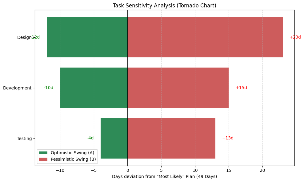
A Tornado Chart is a special type of bar chart used to compare the relative impact of different variables. In project management, it ranks your tasks by how much their uncertainty affects the total project duration.
The chart gets its name from its shape. We place the task with the widest ‘swing’ (the difference between the best and worst case) at the top, and the tasks with the smallest impact at the bottom. This creates a funnel-like appearance that looks like a tornado.
How the Math Finds the ‘Risk Drivers’
To create this chart, we run a sensitivity test. Instead of looking at 10,000 random futures at once, we look at what happens when we ‘swing’ one task at a time.
- The Baseline: We start by assuming every task hits its ‘Most Likely’ (M) estimate. This gives us our baseline project duration.
- The Swing: We then take one task and force it to its absolute ‘Optimistic’ (A) value while keeping everything else at the baseline. We record the change. Then, we force that same task to its ‘Pessimistic’ (B) value and record that change.
- The Ranking: We repeat this for every task in the schedule.
The tasks that cause the biggest movement in the final project date are your true ‘Risk Drivers.’ These are the items that occupy the wide top section of your tornado.
Why Every Project Manager Needs This
The Tornado Chart is your roadmap for resource allocation. Here is how it changes your day-to-day management:
1. Stop Micromanaging the Wrong Things
We often spend our energy chasing every small delay. But the Tornado Chart might show you that a task you have been stressed about actually has almost zero impact on the final deadline because it has plenty of ‘float.’ It lets you let go of minor issues and focus on the heavy hitters.
2. Targeted Risk Mitigation
If ‘System Integration’ is at the top of your Tornado Chart, you now have a data-backed reason to ask for more resources or a more experienced lead for that specific task. You aren’t just asking for help; you are proving that this one task is the single biggest reason your P90 date is so far out.
3. Communicating with Clarity
When you show a Tornado Chart to stakeholders, you are showing them the ‘Levers’ of the project. You can say, ‘If we can reduce the uncertainty in this top task by just 10%, we pull our entire project P90 date in by 5 days.’ That is a powerful, executive-level conversation.
Try It Yourself: Python Sensitivity Analysis
If you are feeling brave or if you know Python, you can generate your own professional Tornado Chart. This script calculates the ‘swing’ for each task and plots them in that iconic funnel shape.
You can copy and paste this directly into a Jupyter Notebook or Google Colab to see which of your tasks is the real project killer.
Python
import matplotlib.pyplot as plt

# --- 1. DATA ---
# This is the 'Most Likely' total if everything went exactly to plan
# Design (22) + Development (15) + Testing (12) = 49 days
baseline_total = 49

# The 'Swing' data: How much the TOTAL project moves if this task hits A or B
# Format: {Task: [Days saved if task is A, Days added if task is B]}
# Example: If Design hits A (10d), it saves 12 days off the 22d estimate.
swings = {
    'Design': [-12, 23],
    'Development': [-10, 15],
    'Testing': [-4, 13]
}

# Sort tasks by the total 'width' of the bar to create the tornado shape
sorted_tasks = sorted(swings.items(), key=lambda x: (x[1][1] - x[1][0]), reverse=False)

names = [x[0] for x in sorted_tasks]
lows = [x[1][0] for x in sorted_tasks]
highs = [x[1][1] for x in sorted_tasks]

# --- 2. PLOT THE TRUE TORNADO ---
plt.figure(figsize=(10, 6))

# Create the bars centered around 0 (the baseline)
plt.barh(names, lows, color='seagreen', label='Optimistic Swing (A)')
plt.barh(names, highs, color='indianred', label='Pessimistic Swing (B)')

# Add a vertical line for the Baseline center point
plt.axvline(0, color='black', linestyle='-', linewidth=2)

plt.title('Task Sensitivity Analysis (Tornado Chart)')
plt.xlabel('Days deviation from "Most Likely" Plan (49 Days)')
plt.grid(axis='x', linestyle='--', alpha=0.5)
plt.legend()

# Add labels to the ends of the bars for clarity
for i, name in enumerate(names):
    plt.text(lows[i] - 1, i, f"{lows[i]}d", ha='right', va='center', color='green')
    plt.text(highs[i] + 1, i, f"+{highs[i]}d", ha='left', va='center', color='red')

plt.tight_layout()
plt.show()
Interpreting the Tornado: What the Bars Are Telling You
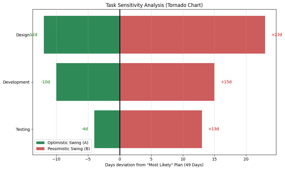
If you just ran that Python code, you are looking at a “funnel” of green and red bars. But what does it actually mean for your project on Monday morning?
To a professional project manager, this chart is a priority map. It tells you exactly how much “power” each task has over your final deadline. Here is how to read the results:
1. The Center Line (The Zero Point)
The vertical black line at the center represents your Baseline Plan. In our example, this is 49 days. It assumes everything goes exactly according to your ‘Most Likely’ (M) estimates.
2. The Green Bars (The “Opportunity” Swing)
The green bars extending to the left show you the best-case scenario.
- For the ‘Design’ task, the bar hits -12d.
- This means if the Design team is lucky and hits their ‘Optimistic’ target, the entire project finishes 12 days early.
- The Insight: This shows you where you have the most to gain by providing extra support or removing roadblocks early.
3. The Red Bars (The “Threat” Swing)
The red bars extending to the right are the most critical part of the chart. They show the worst-case impact.
- Look at ‘Design’ again. It has a red bar of +23d.
- This tells you that if Design hits its ‘Pessimistic’ estimate, the project doesn’t just slip by a few days—it blows past the deadline by over three weeks.
- The Insight: This is your #1 threat. Even if ‘Testing’ is late, it only adds 13 days. ‘Design’ is nearly twice as dangerous.
4. The “Width” of the Bar (Total Sensitivity)
The most important thing to look at is the total width (from the far left of the green to the far right of the red).
- A wide bar means a task is “High Sensitivity.” Any change in this task causes a massive ripple effect.
- A narrow bar means “Low Sensitivity.” Even if this task is unpredictable, it doesn’t have enough “leverage” to ruin your project.
How to use this in your next meeting:
When you look at this chart, you stop being a manager of tasks and start being a manager of risk.
- Focus on the Top: If you have $5,000 in extra budget or 10 hours of overtime to give, you give it to the task at the top of the tornado.
- Ignore the Bottom: If the task at the bottom of the tornado is running a day late, do not panic. The math proves that it is not the “bottleneck” for your final delivery.
Summary: Focus on the ‘Peak’ of the Tornado
The Monte Carlo simulation gives you the ‘Big Picture,’ but the Tornado Chart gives you the ‘Action Plan.’ By identifying which tasks are your true risk drivers, you move from being a reactive manager to a proactive leader.
Don’t just track your schedule – diagnose it. Find your tornado, tackle the top task, and watch your project confidence soar.